PyQt6 QTableWidget: Build, Style and Read a Table
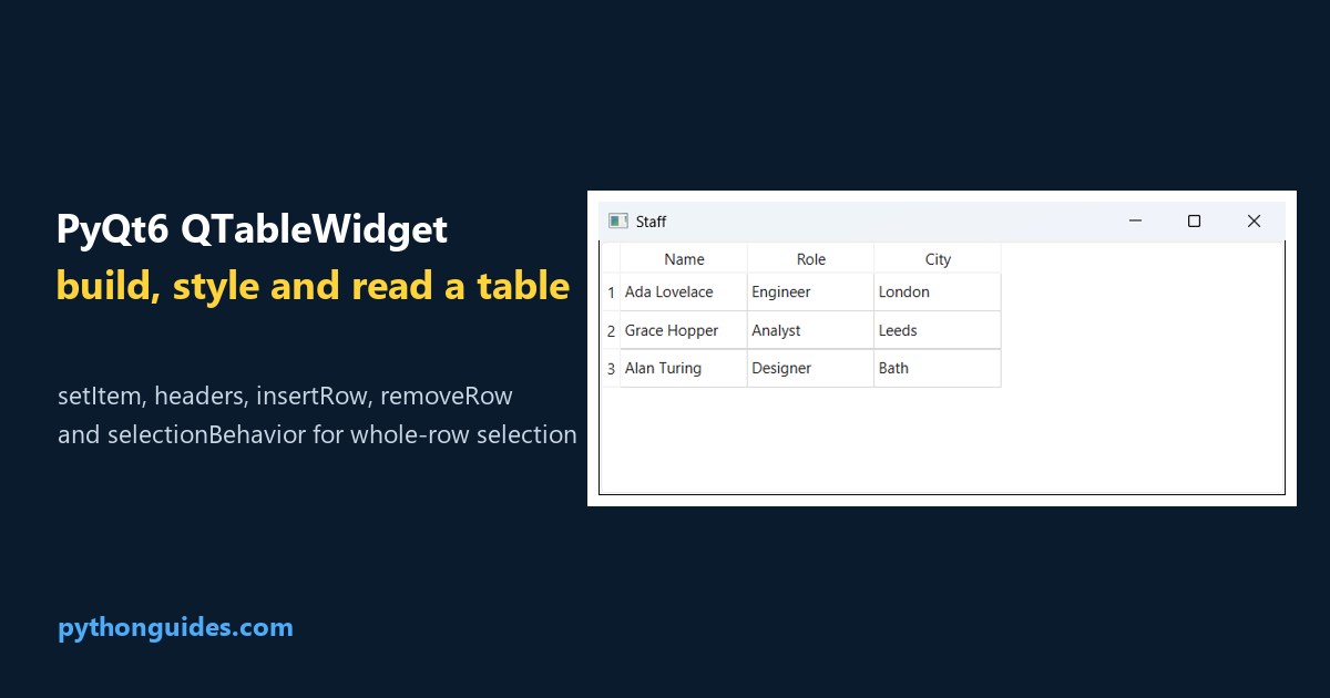
PyQt6 QTableWidget: a real Qt window showing a three column staff table with name, role and city

QTableWidget is the ready-made table in PyQt6. You give it a size, set the header labels, and drop a QTableWidgetItem into each cell: It keeps the data for you, which is what separates it from QTableView. For anything up to a few thousand rows that’s exactly what you want. Screenshots below are real windows on … Read more >>
PyTorch nn.Conv1d: Shapes, Weights and Examples

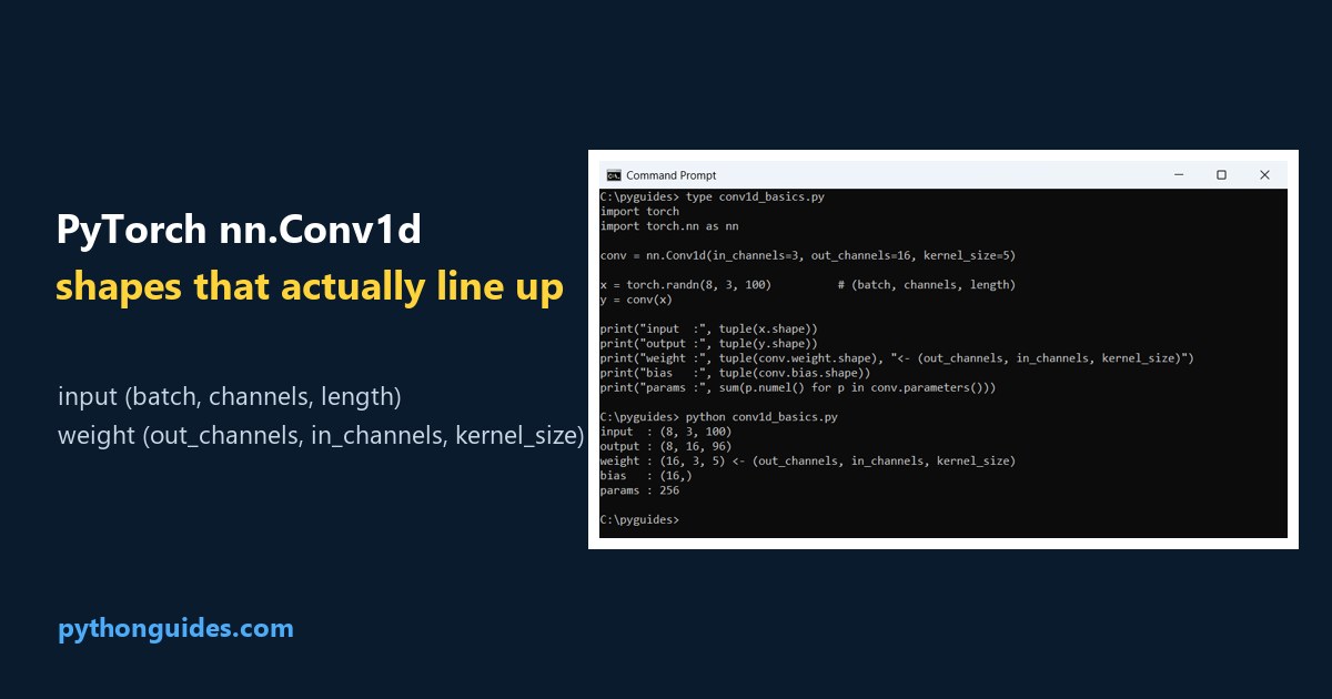
PyTorch nn.Conv1d: the Command Prompt showing the input shape, output shape, weight shape and parameter count of a 1D convolution

nn.Conv1d is the 1D convolution layer in PyTorch, for signals, time series and text. It expects a 3D tensor of (batch, channels, length): Nearly every problem with it is a shape problem, and the two shapes to keep straight are that input and the weight, which is (out_channels, in_channels, kernel_size). Runs below are on PyTorch … Read more >>

Python isdigit(): What It Accepts and What It Rejects

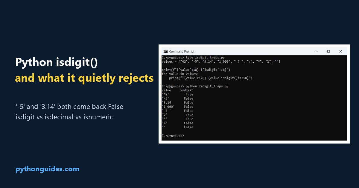
Python isdigit: the Command Prompt showing that negative numbers and decimals both return False

isdigit() is a Python string method that returns True when every character in the string is a digit, and False otherwise. Those last two are why you’re probably here. A minus sign isn’t a digit and neither is a full stop, so isdigit rejects most real-world numbers. Everything on this page ran on Python 3.12.5, … Read more >>

Matplotlib Subplot Titles and the Figure suptitle

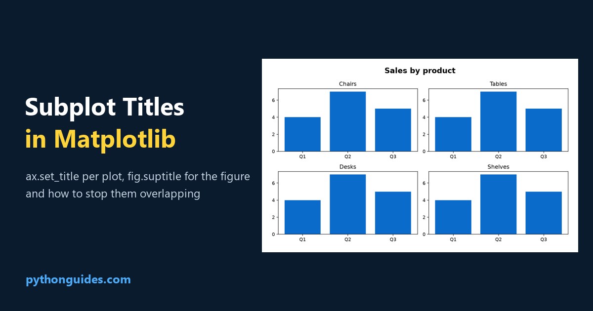
Matplotlib subplot titles: a two by two grid of bar charts each with its own title under one bold figure title

A Matplotlib subplot title comes from ax.set_title(), and the title over the whole figure comes from fig.suptitle(). They’re different objects on different owners: Use both together and they collide, which is the reason most people end up searching for this twice. The fix is one line and it’s further down. Figures below come from Matplotlib … Read more >>

Draw a Circle in Python Turtle: Arcs, Fills and Polygons

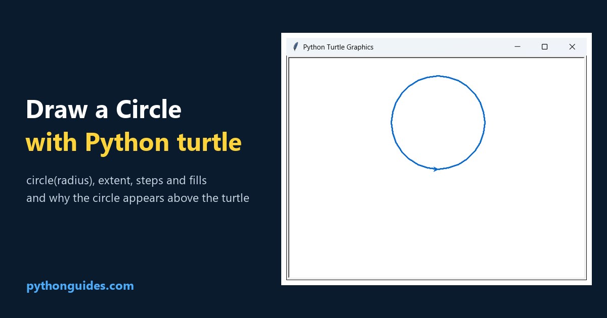
Python turtle circle: the turtle graphics window showing a blue circle drawn with a radius of 100

To draw a circle in Python turtle, call circle() with a radius: The surprise is where it lands. It’s drawn above the turtle rather than around it, and the next section shows why. Every screenshot here is a real turtle window on Python 3.12.5. Drawing a circle in Python turtle One call does it. The … Read more >>

NumPy unique: Values, Counts and Unique Rows

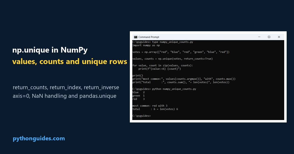
NumPy unique: the Command Prompt showing unique values with their counts and the most common value

np.unique() returns the distinct values of a NumPy array, sorted, with duplicates removed. Add return_counts=True and you get how often each one appeared: The sorting is not optional, which is the first thing that surprises people coming from pandas. The axis argument is the second. Runs below are on NumPy 2.5.3, pandas 3.0.6, Python 3.12.5. … Read more >>

Customize xtick Labels Using fontdict and fontsize in Matplotlib

xtick Labels Using fontdict Matplotlib

I have found that clear communication is the soul of any Python visualization. I often see developers create stunning charts, only to have the audience squint at tiny, unreadable axis labels. Matplotlib remains the powerhouse for Python plotting, but its default settings often feel a bit too clinical for high-stakes presentations. When I am building … Read more >>

Set xticks Range and Interval in Matplotlib

Set xticks Range in Matplotlib

I have spent over a decade building data visualizations in Python, and if there is one thing I’ve learned, it’s that default axis ticks are rarely perfect. Often, Matplotlib tries to be helpful by guessing where your ticks should go, but it often ends up cluttering the x-axis or skipping vital data points. In this … Read more >>

Matplotlib Boxplot: Set X-Axis Tick Labels

Matplotlib Boxplot Set X-Axis Tick Labels

In my decade of working as a Python developer, I have spent countless hours staring at data visualizations. One of the most common challenges I see beginners face is making their charts readable for a non-technical audience. When I first started building Python data models, I often struggled with messy axis labels. My boxplots would … Read more >>

Change Tick Direction in Python Matplotlib

Change Tick Direction in Python Matplotlib

If you have spent any time building data visualizations in Python, you know that the “default” look isn’t always what you want for a high-end report. One small detail that often catches my eye—and bugs me—is the direction of the axis ticks. By default, Matplotlib usually points them outward, away from the plot area. In … Read more >>